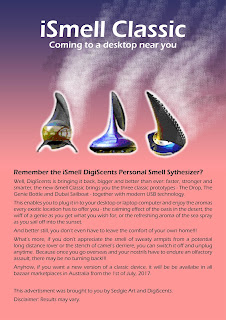
Anyway, here are the two latter images that have earned me this feedback and here is what I have had to say in my assignment:
Me, being in a hurry to get this unit over and done with, accidentally uploaded this assignment without the suggested changes to the poster design. As a result, my assessment was marked ‘Incomplete’. The next few pages consist of the ‘hero’ images and magazine ads (for a likely IT or graphic design magazine.
This ‘hero’ image consists of three groups of layers:
• The iSmell background: pink and purple colour scheme (symbolises nice smells which go with the colours of the iSmell prototypes, and also with a sunset or sunrise in the tropics), the gradient goes from darker to lighter.
• The iSmell Prototypes: three prototypes - The Drop (to symbolise the life-giving drop of water), The Genie Bottle (symbolising ‘wish fulfilment’) and The Dubai Sail (reminiscent of the Burj Al Arab Hotel which takes on the appearance of a sail boat).
• The iSmell text: Light heading and subheading on a dark background.
With the exceptions of the iSmell Prototype, the colour scheme of this image is the opposite of the previous one:
• The iSmell background: Still a pink and purple colour scheme but this colour scheme is more reminiscent of a sunset or sunrise, depending upon which direction you are looking, and what time of
the day it is.
• The iSmell prototypes: same devices but different backgrounds.
• The iSmell Text: Dark heading and subheading on a light background.
The images below are the full magazine ads for a likely IT magazine. People in the IT industry were probably likely target markets. However, a B2B client could also be a travel agency or tourist bureau trying to promote their location over the Internet;and the end-user could also be someone planning to visit a particular location and wants to prepare oneself for the 'culture shock' they are likely to experience. 😁
While Ms Campbell suggested a white background with plain black text, I felt the current colour scheme would be more appropriate. However, my dear followers, take a look at the ads themselves and you be the judge.
cheers,
Colleen 👩👳👸


Comments
Post a Comment
Thank you for your feedback. The moderator will soon moderate your comments and say 'yay' or 'nay'. Any posts that aren't relevant to the topic of this blog will be rejected immediately.