Later on, I had two more people
leave feedback on the page forums[1].
One of these people was Mega
Ricky. Here is what he had to say about
it being on his mobile phone browser:
Hey Colleen,
Initial feedback: I've clicked
the link while I'm using my mobile and the site is not responsive at all for
different devices.
In today's world, it is vital a
site looks good on all size screens, especially mobile. Refer pics below of
what I see when I click the link.
I will have a look at it on my
iMac later, but initially on mobile because it's not optimised I'm put off
immediately because it looks all over the shop and I'm not sure what I'd even
be clicking on if I did click the menu.. the slider image (I have to be honest)
looks very cheap and tacky and I don't feel it reflects the product
well..
I will respond to your specific
points once I've looked at it on a larger screen.
The other person to leave
feedback on the Facebook forum was Ela Keeson.
Here is what she had to say:
Hi Colleen,
I
have had only a little play with Muse before... well done, for getting a site
up and running. However, I feel the site could improve with some
adjustments.
There
is a "page not found" error when clicking on the link. Both, mobile
and iMac. I was re-directed to your site by clicking on the "back to home
page"
Overall:
site should be responsive / optimized for mobile
a more monochromatic/ black colour scheme can look modern and clean but does
not suit an outdoor-foodie themed webpage . The text size shrinks when you resize the window. maybe you could try flexible line lengths?
As a customer, I would like to get more info's about the tours. How many km per day? Easy/ medium...? Where do I stay?
Maybe
you could flip the colours and use predominantly white?
The
banner image on the home page is changing but it shows the same image;
Your
logo text is cut off and the 3D extrusion makes it look dated.
Maybe
you could use more pictures to show the landscape and the mouth-watering food
to get peoples interest.
Have
fun with it!
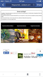
I then tested it on my ‘mobile’
browser also (for my iPod touch), and found that Mega Ricky had a point. Here are two screenshots showing the result.
This screenshot shows the top
part of the Home page. I have found
these problems:
I felt the body text and the
image panel look okay in this screenshot but I still found the following
problems:
I also tested the same site on
Google Chrome (though this time it was on my iPod touch) and it produced the
same results. I would therefore consider
the site unsuitable for mobile devices.
I then checked the Open
Colleges (Study Period 6, Module 1) forum on Thursday, 24 November 2016, with
the thread for Progress Challenge 3, and saw Wendy’s comment about the output
on different browsers and devices[1]. The positive things she said was that she
liked my banner and preferred the ‘retro’ look with the flat text to the 3D
text; and she suggested changing the subtext to either a sans-serif font or a
less bold version of the Rockwell text.
After that, I thought it would
be time I redesigned the page to eliminate the ‘clutter’ that is causing it to
look a certain way. I did so in the hope
that the site would be more responsive in its layout, and to different
browsers.
I took the social media badges
out of the footer (apart from the Adobe Muse one). I also removed the banner I was hoping to
include – even though I was happy, myself, with the job I did – some people
thought it was ‘outdated’.
When I previewed the Master
page in desktop mode, I did not think it looked so great. This was mainly because the images were
off-centre.
However, upon previewing
the browser at a narrower width (and perhaps in tablet mode), the layout was
somewhat more ‘balanced’.
This next screenshot shows how
I imagine it as a mobile site. I figured
that in order to get around the problem of responsiveness and usability, it
would be best to design the Master page with a responsive width.
This next screenshot shows how
one would expect to look when viewing the page on a mobile device.
I brought back the banner so I
had two different versions of the same site.
My main concern was the amount of white space on the bottom and the
pictures shrinking on a smaller device, and the teacher pointed this out to me.
I conquered the problem of
the excess white space by using a sticky footer. There was still a bit of a problem, but it
wasn’t as obvious as before - there was still some white space but it was all
above the footer, and the text responded well to a decreased screen width.
From then on, I had the screenshots from my 'mobile' (iPod Touch) browser (in Safari).
From then on, I had the screenshots from my 'mobile' (iPod Touch) browser (in Safari).
[1]Facebook (2016): Screenshot of The Gourmet Cyclist, in https://www.facebook.com/photo.php?fbid=10211030797831070&set=p.10211030797831070&type=3&theater
[1] Open Colleges (2016):
‘Progress Challenge 03 (thread), in Study Period 6, Module 1 Forum, https://learning.opencolleges.edu.au/mod/forum/discuss.php?d=90740


Comments
Post a Comment
Thank you for your feedback. The moderator will soon moderate your comments and say 'yay' or 'nay'. Any posts that aren't relevant to the topic of this blog will be rejected immediately.